 Case Study · Website Transformation
A complete website transformation for Elite Class LV, Ebony Danford’s mobile notary, loan signing and apostille business in Las Vegas. The old site was one page with a photo and a bio. The new one explains six services, answers real questions and gets appointments booked - without changing what makes Elite Class LV trustworthy.
Before a pixel changed, we went through the old site top to bottom. Six things stood between the business and the clients looking for it.
Everything lived on a single page - a hero, a bio and three trust badges. No services list, no process, no FAQ.
One generic “Book Appointment” button was the only action on the whole site - no call link, no text link.
Notary, loan signing and apostille were three words under three stock photos - no document types, no idea what each service covers.
Real questions clients ask - what to bring, how fast Ebony can arrive, what an apostille even is - had no answers on the site.
No business type declared to Google - no way for a search engine to know this is a notary serving Las Vegas.
No structured data, no FAQ schema, no llms.txt - an AI assistant asked about mobile notaries in Las Vegas had nothing to read here.
We saved a copy of the old site and audited it - and we’ll tell you what it did right, too. Here is the honest scorecard, old versus new.
Every row above was checked on saved, same-day copies of both sites. Where the old site already did something right - like the Calendly booking link it already had - the table says so.
The old site blocks being framed by any other page, so both sides here are real, same-day screenshots - not mockups. The old site is one page with real content ending well before the page does. The new one is a full, structured experience.
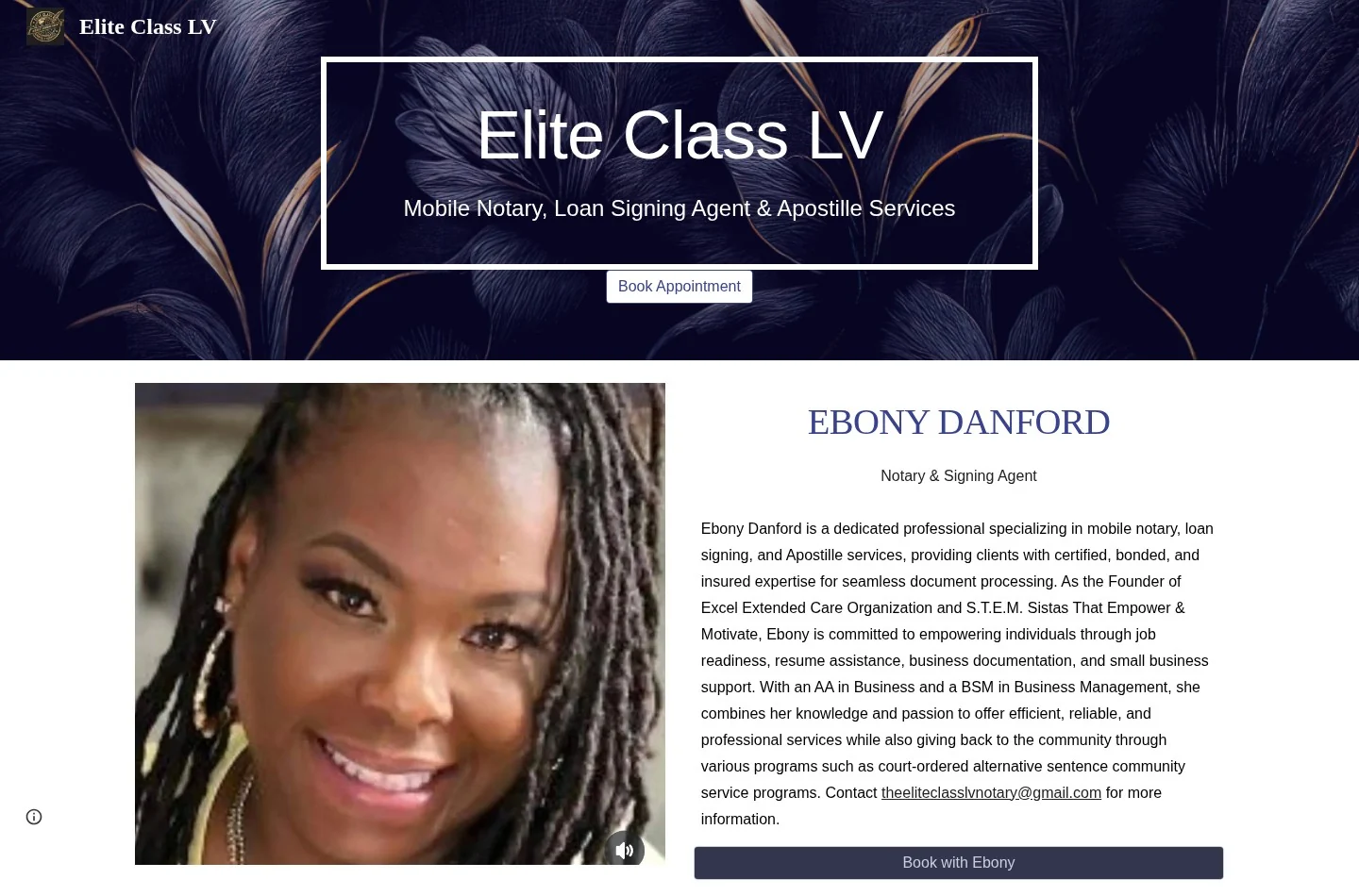
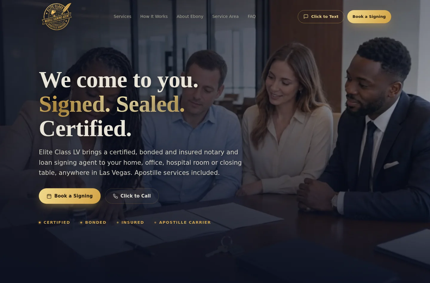
The homepage. Below, compare six real sections of the new site against what existed - or didn’t - on the old one.
Tap a section to open the full-screen comparison - real screenshots, not mockups.
So the redesign was built for the phone first. Both screens below are same-day captures at iPhone size, scrolling automatically so you can see the whole page - not just what fits above the fold.


On the new site, every action above is one tap from any screen - a Calendly link to book, a tel: link that dials, an sms: link that opens a pre-filled text, and jump links straight to services and FAQ.
Anyone can make a website prettier. The layer underneath - the one Google and AI assistants actually read - is where this redesign does its quietest work.
What most businesses have and never know it
What we give every client
We didn’t just make it prettier.
We gave Google and AI something to read.
Every line above was checked on saved, same-day copies of both sites. We don’t promise rankings - nobody honestly can. We build sites that search engines and AI assistants can actually read, which is what rankings are built on.
Here is what was actually delivered inside the 24 hours.
One page rebuilt as six clear sections: Home, Services, Process, About, Service Area and FAQ.
Every section designed for the phone first, where most clients will actually see it.
Call, text and Calendly booking placed on every screen, not buried in one button.
Mobile Notary, Loan Signing, Apostille, Document Prep, Jail Notary & Field Inspection - each explained.
Reach out, we come to you, signed and sealed - spelled out so clients know what to expect.
Notary business type, address, coordinates - written in the format Google and AI read.
5 real client questions - what to bring, how fast, what an apostille is - answered in structured form.
Meta description, social tags, canonical URL, sitemap, robots.txt and an AI-facing llms.txt file.
Instead of three service names with no descriptions, the new site gives each of the six services its own explanation - what it covers, and who it’s for.
Every card above is a real section on the new site, linked from the live URL in this case study - not a private mockup.
No made-up traffic charts. Just what is finished, checked and waiting for the go-ahead.
One page, no structure
Services named, not explained
No FAQ anywhere
No service area stated
No structured data
One generic booking button
Six clear sections
Six services, fully explained
5-question FAQ
Service area published
Notary & FAQ schema added
Call, text & booking on every screen
Published industry pricing puts a custom small-business website build like this at $8,000 to $15,000, on timelines of 4 to 6 weeks - before hosting, maintenance and every future edit are billed on top.
Each line, typically billed separately
Design
Development
SEO setup
Copywriting
Hosting
Maintenance
Every future edit
One build fee, one monthly price - all of it included
Complete redesign, delivered in 24 hours
Hosting & SSL included
Unlimited edits - you text it, we ship it
Search & AI setup, kept current
Maintenance & monitoring
Real human support by text
This build carried no upfront fee at all. Most builds land in the same range, with the monthly price covering hosting, edits and upkeep going forward.
Send the link to the site you have today. That’s the whole assignment.
Design, your photos turned into video, and the full search & AI setup - typically inside 48 hours.
You review your new site at a private link - exactly like this page - before it ever replaces your current one.
Send us the website you have today. We’ll show you what it could become.